
A few days ago, someone in my LinkedIn feed shared a screenshot of a post from X. My first assumption with any screenshot from social media (rather than a direct link) is that it’s fake, so I went and found the original. It was real, and it had been viewed 7.8 million times. The post said that OpenAI’s internal benchmarks showed GPT-6.1 Sol crushing Opus 5.5, with Anthropic struggling to keep up. The chart below it backed that up nicely: three coloured lines climbing over time, OpenAI’s green line sitting comfortably on top, Anthropic’s in the middle, Grok at the bottom.
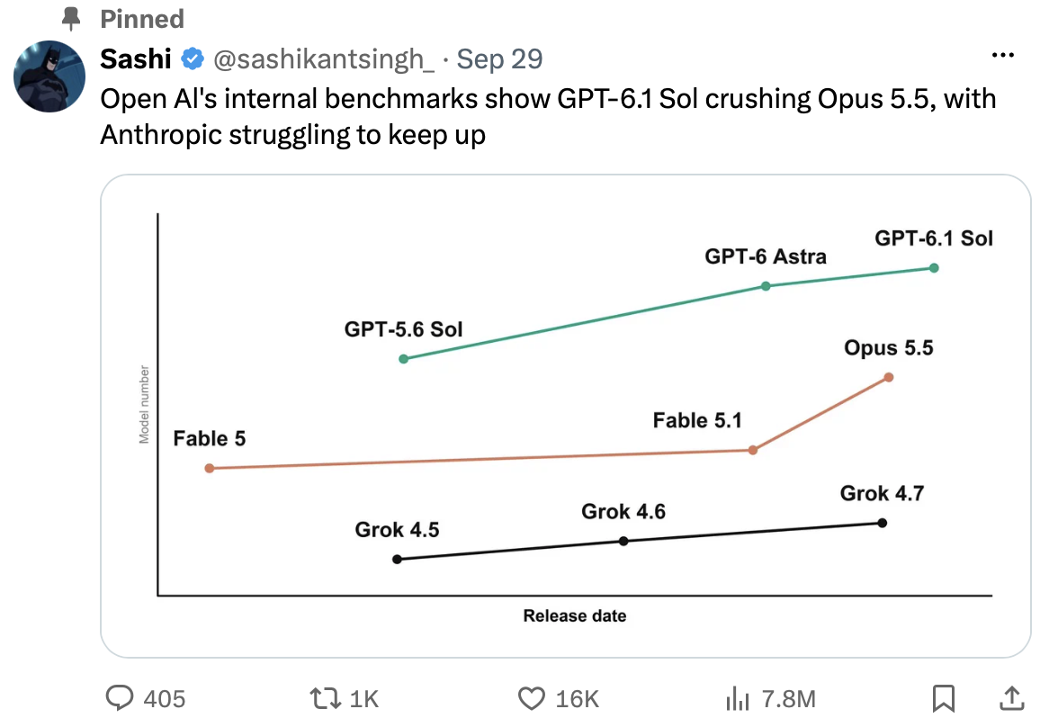
Now look closely at the label on the vertical axis. It’s small and grey and easy to miss. It says “Model number”.
That chart isn’t measuring performance at all. It’s plotting the version number in the product name against the release date. GPT-6.1 is higher than Opus 5.5 because 6.1 is a bigger number than 5.5. That’s it. That’s the whole insight.
I assume it’s a joke, and plenty of the replies treat it as one. Plenty of others clearly took it at face value. The author never says either way, and the fact that I have to assume is what makes it interesting. A joke that only lands for the people who read the smallest text on the image works exactly like a deception for everyone else. 16,000 people liked it and a thousand reposted it, and I’d be surprised if most of them read the axis.
What makes this one clever is that the chart isn’t wrong. As far as I can tell, every point sits exactly where its version number puts it. There’s no scale on the axis and no zero, and the only clue to what’s being measured is the faintest text on the image. Nothing in the picture is false. The deception lives entirely in the gap between the headline and the axis.
The headline is a different matter. If OpenAI has no such internal benchmarks, that sentence is simply false. The chart’s job is to make the false sentence feel supported, and it does that using nothing but true information.
There’s a word for this, and it’s not new. Palter dates from the 1530s1, and Shakespeare used it in exactly this sense. Macbeth, discovering that the witches’ prophecies were true to the letter and ruinous all the same, curses them:
“That palter with us in a double sense;
That keep the word of promise to our ear,
And break it to our hope.”
William Shakespeare, Macbeth2
Researchers have since given it a sharper definition:
“Paltering is the active use of truthful statements to convey a misleading impression.”
Todd Rogers et al., “Artful Paltering”3
It’s distinct from lying by commission, where you say something false, and from lying by omission, where you leave out something that matters. A palter says only true things and lets you draw the wrong conclusion yourself.
The same research found something I find more interesting than the definition. People who palter believe it’s more ethical than an outright lie, while the people they misled, once they find out, judge the two about the same. The palterer is thinking “I told the truth” and the target is thinking “I was misled”. That’s also why the joke question matters less than it seems. “It says model number right there” is a perfect defence, and it changes nothing for the reader who didn’t look.
None of this is new. Darrell Huff catalogued these tricks in How to Lie with Statistics back in 1954, and the book is still worth reading: short, funny, and depressingly current. When I wrote about data accuracy, I set aside charts that mislead on purpose and pointed at Huff instead.
So why does it work? Because nobody reads axis labels at scroll speed. We read the headline, glance at the shape of the lines, see that the shape agrees with what we were just told, and move on. That’s System 1 doing what it does best: producing a quick, confident impression from whatever is in front of it. Reading the axis is System 2 work, and System 2 only shows up when something feels off. A palter is built so that nothing feels off.
That isn’t a character flaw in the readers. It’s how all of us read, and anyone who wants to mislead us is designing for it.
That’s what concerns me beyond one joke about AI models. We’re living through a flood of disinformation, and a lot of it isn’t outright lies. Outright lies get fact-checked. A palter survives the fact-check because every individual piece of it is true: the real quote clipped from its context, the accurate statistic paired with a conclusion it doesn’t support, the genuine photo from a different year. The headline does the misleading, and the details sit there, technically correct, waiting for someone to look at them.
We’d all benefit from paying more attention to the details than to the headline. Who made this? What exactly is being measured? Where’s the original? It takes thirty seconds, and it’s the same habit whether you’re looking at a viral post or your team’s dashboard.
Before you believe the line, think about what it’s really saying.
-
Originally meaning “to speak indistinctly”, with the sense of playing fast and loose appearing around 1600. See Etymonline and Dictionary.com. ↩
-
William Shakespeare, Macbeth, Act 5 Scene 8. MIT Shakespeare text ↩
-
Todd Rogers, Richard Zeckhauser, Francesca Gino, Michael I. Norton and Maurice E. Schweitzer, “Artful Paltering: The Risks and Rewards of Using Truthful Statements to Mislead Others”, Journal of Personality and Social Psychology, 2017, Vol. 112, No. 3, 456-473. doi:10.1037/pspi0000081 ↩