
When we’re visualizing data, the point isn’t just to make a pretty picture. It’s to help us understand what the data is saying so we can make more effective decisions.
Why a visualization at all? Because about half of the cerebral cortex is involved in visual processing and that means we’re much better at parsing visual data than raw tables.
I had a situation recently with a client where we were looking at cycletime data in a scatterplot. The data was correct, and yet it was almost impossible to read. A handful of extreme outliers pushed everything useful down into a thin strip along the bottom of the chart. The team’s questions were around patterns in the data but because everything was compressed into the bottom strip, all we could see were the outliers and not the data we actually cared about. A chart that’s accurate and can’t inform a decision still isn’t doing its job.
Note: these charts use fabricated data to illustrate the point. They are not client data.
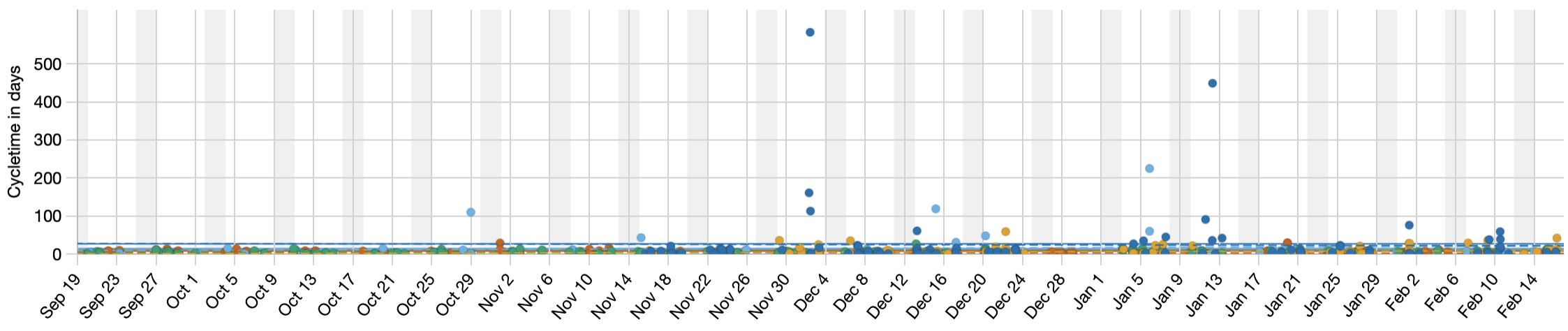
The first question with any outlier is whether it’s noise or signal. Sometimes the outlier is the most important thing on the chart, the one item that’s been stuck for months and tells you something is badly wrong. Here it was noise. We already knew those few items were slow. What we’d lost was the ability to see everything else. So the goal was never to delete the outliers, it was to stop them from drowning out the pattern.
The obvious move would be to remove the outliers, and that would skew the percentile calculations. The next option would be to force the maximum Y axis lower, which makes the rest of the chart readable while hiding the outliers completely. That solves one problem by creating another.
What we really want is for all the data to be present while emphasizing the parts that are immediately relevant.
Here’s what we ended up with.
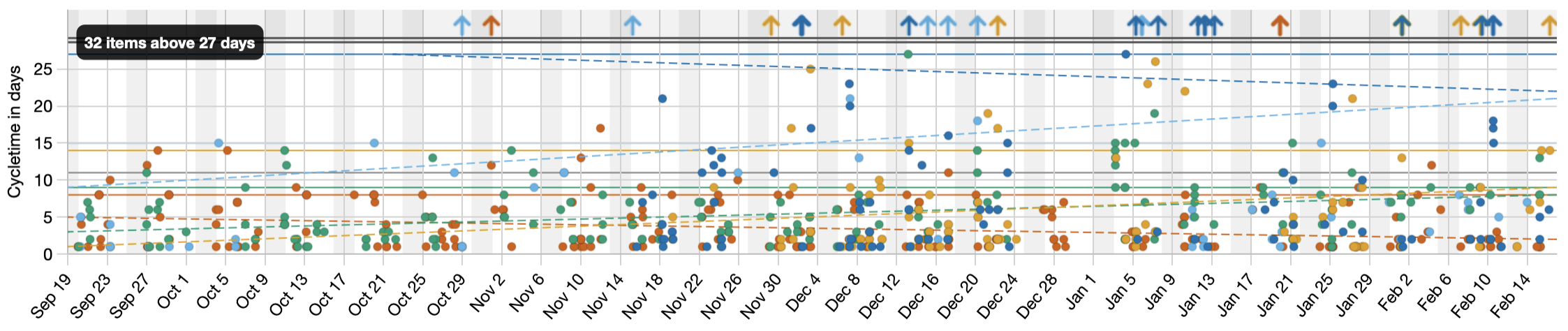
We capped the Y axis so the bulk of the data gets the focus, and moved the outliers into a labelled band along the top, each one still marked as an arrow with its real value one hover away. Nothing is dropped and nothing is hidden. Just as important, this changes only what you see. The percentiles and every other calculation still use the real numbers. We improved how the data is displayed without impacting the information in that data.
With the pattern visible again, the team could answer their questions, and they could made better decisions. That’s the whole point of a visualization.
Since this seemed generally useful, this feature is now available in JiraMetrics v3.2.
See also: Survivor Bias, the cost of dropping the data that doesn’t fit the picture.