
For years, I’ve been watching teams show off cumulative flow diagrams as an indication of their progress. Everyone nods their heads and pretends that they understand what they’re looking at, thinking that it must be obvious to everyone else. Except it isn’t.
It’s a great chart, packed with useful information, but its only helpful if we know how to read it and most people don’t. I deliberately put off adding a cumulative flow diagram to JiraMetrics for years, for this exact reason. [Spoiler: it’s there now]
Then to make it worse, there are many poor implementations of CFD’s (ie Jira) that inaccurately render the diagram so even if you do know how to read it, the information is wrong.
The fundamentals
Let’s start with the fundamentals. What is it graphing in the first place?
We’re showing how many items were in each workflow state (typically columns on a board) at any given time. Ignore the crosshatching for the moment - that’s a subtlety that not all CFD’s will show.
In this board below, we can see that there are five workflow states ranging in order from Ready to Done.

We can see that the Done section is steadily growing, which is good because it shows that we’re actually completing work. The slope of the line tells us how fast we’re completing things.
The thickness of each of the bands above Done tell us where the work was piling up. We can see, for example, that at the beginning, we had far more items Ready than we had in active development and that indicates that we’re planning further ahead than perhaps we need to. This same team later reduced that Ready band, showing that they were beginning to operate more in a just-in-time fashion.
Is that necessarily better? No, the data tells us what’s happening but not why. It’s generally better that we have a smaller Ready band, but that isn’t always going to be true. The CFD provides no judgement of what’s happening, only visibility.
Arrival and departure rates
The CFD can show us the arrival and departure rates as seen by the red and green dashed lines that move from bottom left to top right.
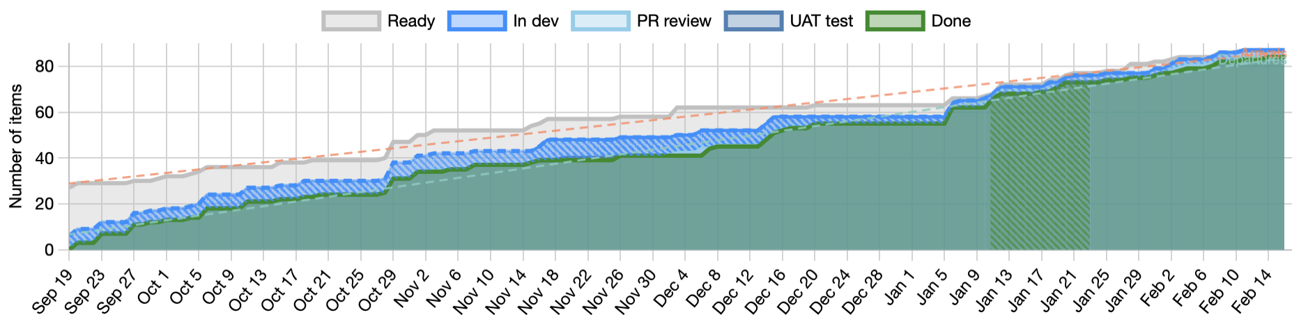
The arrival rate and departure rate lines tell us respectively the rate at which work is arriving in the system and the rate at which it’s leaving. If the two lines are parallel then we have a stable system. Things are leaving at the same rate as they arrive.
If the lines are diverging then we likely have a problem. We’re taking on more and more work and as our Work In Progress (WIP) increases, we’re going to get worse in almost every measurable way.
If the lines are converging then we are lowering our WIP and are likely getting better at everything. Again, the CFD provides no judgement. The lines tell us what is happening but not why.
Getting into Little’s Law
The three key flow metrics of WIP, Cycle time, and Throughput have a clear relationship as defined in this formula that makes up Little’s Law.
We can see this relationship visually in the CFD as shown by the black triangle in the diagram below.
- For any point in time, the total WIP is the distance from the top of the highest band to the top of the lowest band (usually “done”).
- From the top of that line, if we draw another line horizontally to the right until it crosses the top of the bottom band then this line measures the approximate average cycle time. Why approximate? We’ll come back to that.
- Then if we complete the triangle by drawing a line from the bottom of the WIP line to the far right of the cycle time line, we get the average throughput.
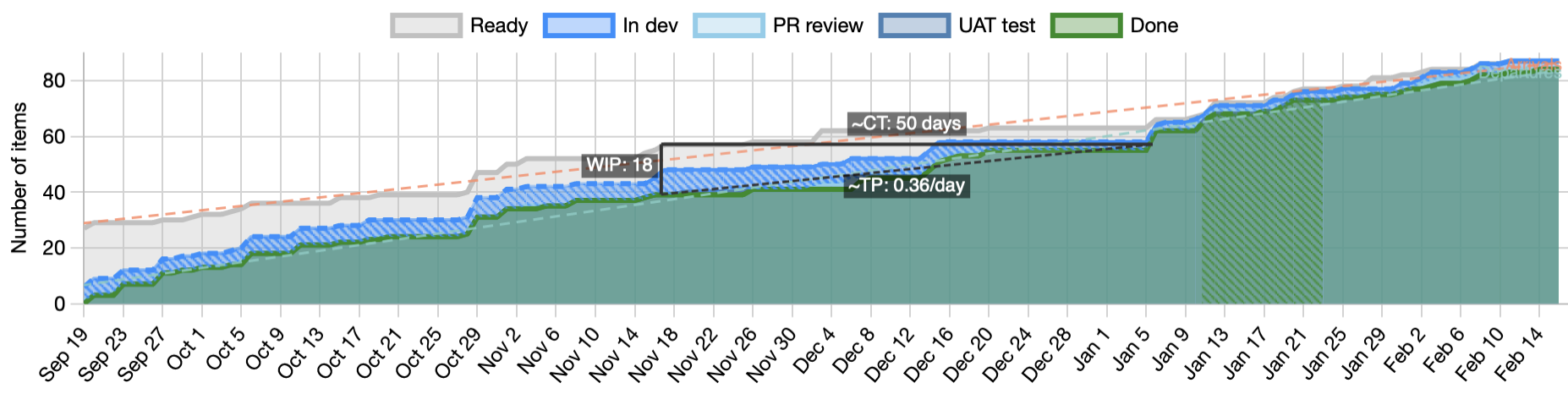
If you’re watching closely, you’ll have already noticed that the triangle isn’t exactly Little’s Law. The law is a relationship of averages of all three and the triangle has absolute WIP as one of the sides. They’re not exactly the same and yet the triangle is still a helpful indicator.
Also note that Little’s law has four key assumptions that must be true for the relationship to hold.
Flow debt
I said we’d come back to the approximate average cycle time that is the top line of the triangle. If we were processing all the work in a perfect first-in first-out order, the assumption is that this would be exactly the average cycle time. Unfortunately, that doesn’t happen with any team that I’ve ever seen. We reorder the work. We do one thing earlier than another because it’s easier or some resource is available now that won’t be available later. Sometimes we give preference to starting new work over finishing work already started, and every time we do that, we interfere with the steady flow of the system. We introduce flow debt and that flow debt causes the calculation to be ever so slightly off.
The cross hatching
Let’s come back to the cross hatching, and at the same time to why the Jira CFD is broken. Note that the cross hatching is something specific to JiraMetrics and is not part of a standard CFD.
A Cumulative Flow Diagram by it’s very definition is cumulative; it can only go up. Yet, the Jira CFD sometimes goes down. What’s happening there?
Jira’s approach seems to be to count WIP in each column at any point in time and graph that. It sounds like a reasonable approach on the surface, but it doesn’t take into account that tickets are allowed to move backwards on the board. When a ticket moves backwards, their implementation now shows the “cumulative” flow going down.
To draw the CFD properly, we can’t allow the lines to drop down, and yet we have to accept the fact that people are still going to move tickets backwards and make a mess of the data. That’s where the cross hatching comes in. If the fill colour for that part of the board is cross hatched, it means that we had to fudge the data to account for people doing things they shouldn’t have done.
Conclusion
The CFD is a powerful tool, packed with useful information, and its worth learning how to read. Just be aware that if you show it in a presentation, you’re likely to lose most of your audience.
See also:
- For a more in depth look at flow metrics, see our Flow Metrics Basics course.
- The JiraMetrics tool and specifically the CFD that it generates. All the images in this article came from that.
- The four key assumptions for Little’s Law