
I’ve been wanting to do a good visualization around WIP limits for a while and now I finally have one that I’m happy with. This is specifically around column based WIP limits since that’s all that Jira supports, and pretty much all my clients use that.
Let’s start with the problem first. What decisions am I trying to enable by visualizing WIP in this way? There are a couple:
- First, are there WIP limits on all the active columns? For a kanban team there absolutely should be and for a scrum team, it’s still a reasonable practice, even though scrum manages WIP through the timebox.
- Are the limits set at a reasonable place? They should be low enough to force us to do the things we don’t want to do, and yet high enough that they aren’t constantly getting in the way. Even when limits are in place, most teams don’t have them set at reasonable values.
- Are there patterns in the WIP data that could identify obstacles?
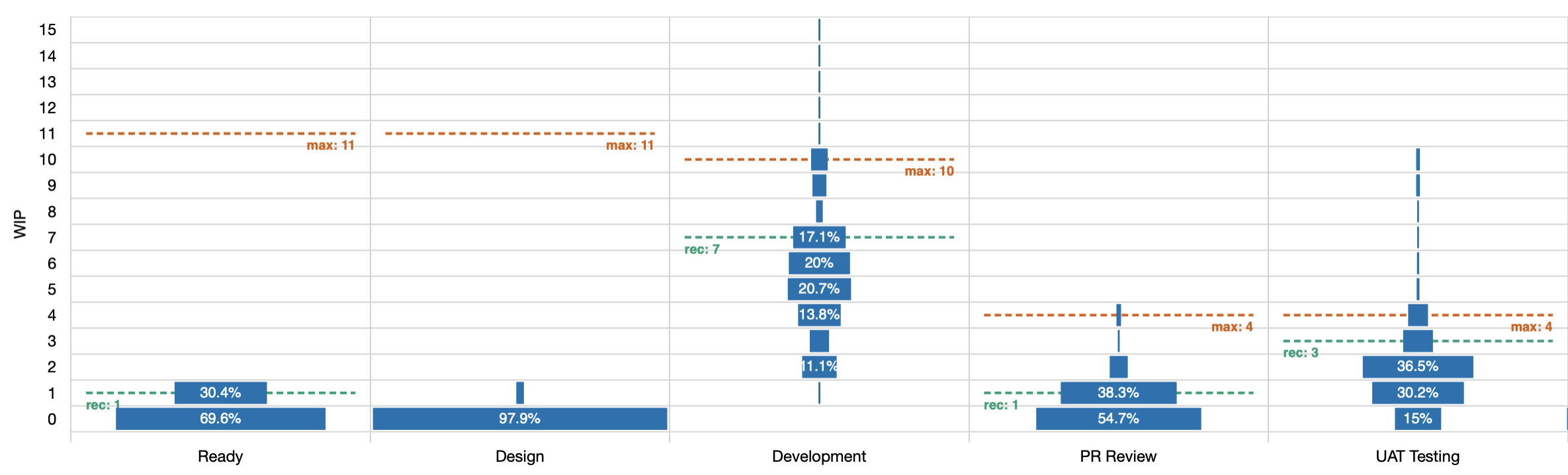
The Y axis shows how many items were in progress (WIP). This is measured by counting all the items that have started but not yet finished at any point in time.
The X axis shows the active columns on the board. Active meaning that items were in these columns while the work was considered started. You won’t see “to do” or “done” columns here because the work was not active at that time.
Then within each cell on this chart, there is a rectangle that tells us how much of the total time that items were in the column, was spend at this WIP level.
From this diagram, you can see at a glance that the design column almost never had any work it it; that most work skipped right over it. Even in the rare case that something was here, it was only ever one item at a time.
You can also see that while the UAT Testing column occasionally had more than 4 items in it, that was exceptionally rare.
Next up, there are potentially three dashed lines in each column, labelled min, max, and rec. The first two are the minimum and maximum as configured in Jira so you can see at a glance how often we’ve exceeded either limit. The third is a recommended maximum that is calculated based on the distribution of data. If your max is set to the recommended level then you should hit the limit occasionally but not constantly (roughly 15% of the time).
In the example here, you can see at a glance that the max of 15 in the ready column is ridiculous as we haven’t even gone past 1 in the time period we’re looking at. That number should be lowered and the recommendation limit is 1.
What about patterns in the data?
We can clearly see that almost no work enters the design column. Do we still need that column or could we just remove it? If it’s not delivering value to us then it’s just noise. Noise slows us down.
We can also see that the development column is never empty and rarely has fewer than 2 items. If this is a scrum team then this could indicate that we’re not actually finishing the work at the end of the sprints.
I’ve seen one data set where the in progress column alternated wide and narrow bars as they WIP went up. A wide bar for a WIP of 3 and a narrow bar for 4, then a wide again for 5. That could suggest that we have some kind of phase gate that only operates on alternate days. There’s nothing conclusive in the pattern but it does help us frame the questions we should ask.
Like this chart? It’s now available in JiraMetrics.
If you’d like help making better decisions from your teams metrics then let’s talk. I’m available to help.